
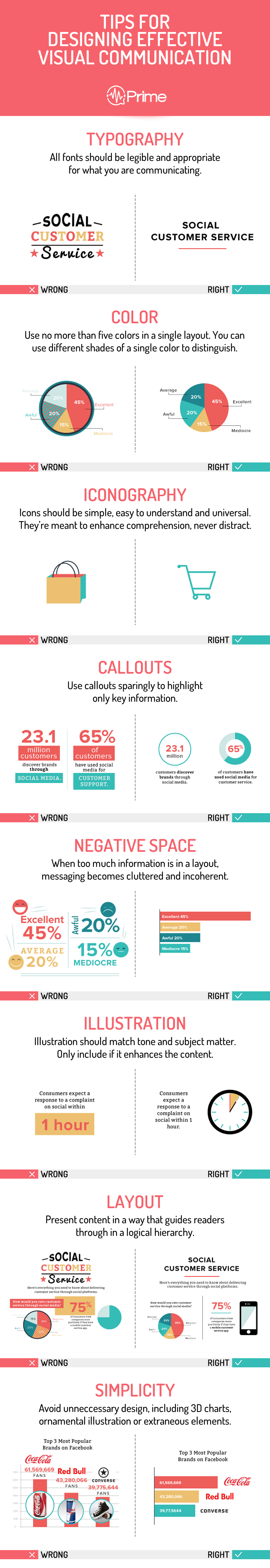
Tipography
All fonts should be legible and appropriate for what you are communicating.
Color
Use no more than five colors in a single layout. You can use different shades of a single color to distinguish.
Iconography
Icons should be simple, easy to understand and universal. They’re meant to enhance comprehension, never distract.
CallOuts
Use callouts sparingly to highlight only key information.
Negative Space
When too much information is in a layout, messaging becomes cluttered and incoherent.
Illustration
Illustration should match tone and subject matter. Only include if it enhances the content.
Layout
Present content in a way that guides readers through in a logical hierarchy.
Simplicity
Avoid unneccesary design, including 3D charts, ornamental illustration or extraneous elements.